1) File > Place. I imported the pictures and used the line tool to align the boy on both front and back cover, however after aligning the back cover correctly there was missing space below the photo.

2) Image > Adjustments > Black & White. I edited the colouring of the photos to turn them into black and white, and then cropped them. I then created brush presets using (Edit > Define Brush Preset) to look like paint splatters and added a few splats of colour on the edges of the pictures. I then used the clone stamp tool to fill in the negative space by copying areas of the concrete and pasting them.

3) Image > Adjustments > Curves. I used the curves tool to adjust the tone and contrast of the photo to make it look more vibrant and professional.

4) Gradient. By applying a gradient with black and transparent colour I created a vignette over both covers. This emphasised the subject more and made it look professional. I adjusted the opacity and changed the effect to 'overlay' in order to make the vignette more subtle.

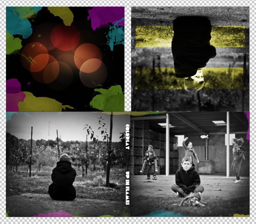
5) File > Place. I placed the photo that would be positioned behind the CD (top left) and cropped it to size and rotated it so that when printed out it would be in the right position.

6) Using the brush presets of paint splatters I had already created I applied neon coloured paint splatters to the image to link in with the front and back covers.

7) File > Place. I placed the inside cover photo (top right) and cropped it to size and rotated it too. I then imported a picture of the up in flames logo and removed the background and positioned it over the top of the photo.

8) Image > Adjustments > Black & White. I used the black and white tool to make the photo duo-toned again and then altered the logo to create a mask where the colour would shine through. However I decided to remove this as I didn't like it or think it looked professional/commercial.

9) Shape tool. I used the shape tool to draw two opaque yellow rectangles to represent the double stripe Chris Martin (the lead singer of Coldplay draws on his hand).

10) Using the overlay effect I made the shapes translucent and lowered the opacity slightly too.

11) Text. I added a new text layer using the 'Every Truetype is a Wisefont' typeface to create the text for the spine of the CD cover to say 'COLDPLAY' 'UP IN FLAMES'.

12) Clone Stamp. I used the clone stamp tool to select areas of the hoodie and paint-paste them to remove the GAP logo.

13) A screenshot of the final photo with the logo removed.

14) A screenshot of the digipak so far.
14) Text. I created a new text layer to say 'COLDPLAY PRESENT UP IN FLAMES' in the 'Every Truetype is a Wisefont' font. Magic Wand > Select Text > Delete. Right Click > Select Inverse > Brush tool to paint white over. This created a cut-out effect. However I found this quite basic and so undid it.

15) Text. I created a new text layer to simply say 'UP IN FLAMES' in white in the Coldplay font and positioned it in the top section on the front cover.

16) Image > Adjustments > Hue/Saturation. I edited the hue of the image behind the CD (top left) to a bright vibrant pink colour to match the neon feel.

17) Filter > Blur > Gaussian Blur. I used the gaussian blur tool to slightly blur the paint splatters behind the CD and around the edges of the front and back covers. This created more of a colour-seeping-in effect as opposed to actual paint splats which I strongly believe looks much more professional.

18) Inner Shadow. I changed the opacity of the cover text and the spine text so it was more overlayed and added an inner shadow to both. This made the text stand out more and make it look more professional.

19) Text. I placed the Parlophone Records logo and created a new text layer to include a copyright phrase to conform to conventions.

FINAL DIGIPAK SCREEN SHOT (BELOW)

This looks great Joe. The yellow band we discussed looks really good and I have used this effect on my poster to link the two. The colour really represents coldplays meta-narrative whilst the greyscale really reflects the child and the essence of our video.
ReplyDeleteThanks Henry! Yeah definitely, I think taking the idea of the two solid strips of colour that Chris Martin draws on his band before performances works well on our digipak too. I have seen the advert and it ties the two together really nicely! Would love to see some screenshots to see the construction and progress of the creation of the ad.
ReplyDelete