1) Firstly I created a blank A4 document as this is the size we would be printing onto. Through 'File' 'New' and selecting the international paper size of 'A4'

2) Next I used the 'Place' tool to put the photograph of the boy in. We took this photo on the second shoot day. I used the 'Black and White' tool in the image adjustment menu after 'resterising the image' in order to customise the black and white effect. I also used other adjustments such as 'Shaddow and Highlights' and the 'curves' tool to change the white highlights and darker tones to create a more contrasted image.

3) After creating the black and white base image I created a text layer and typed 'Up In Flames' in the conventional coldplay font which i found on dafont.com as 'every truetype is a wisefont'. I then used the 'magic wond tool' to select hte text, selecting inverse and deleting to create an effect that made the text subract itself. Then the selection allowed me to fill the outer area around the text with white so the text was visable.

4) After I used the 'Magic Wond' tool to select the text, right clicked and selected 'feather'. I changed the feather property to 6px. This was to get rid of angle sharp edges that didnt look natural, the result is shown below.

5) Then I used the 'Rectangle Marquee Tool' to draw two rectangular boxes and painted them yellow. This looked great although it masked the original image and was quite dazzling. So I changed the 'opacity' to 63% which gived a great look.

6) After I thought that the Coldplay font needed a shaddow, so I applied a 'drop shaddow' effect by double clicking on the layer and changed the angle to 56%, the distance to 9px, spread to 9% and the size to 5px.
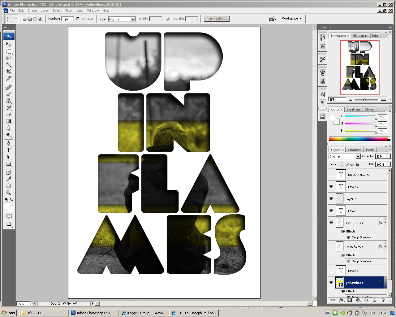
7) After this I thought the the orginal image was still very masked by the white background and that there was quite a lot of negative space in the advertisment. I changed the opacity of the white to 53%. This allowed the original image to seep through and just about ilimate any negative areas. I also added some titles to the areas above and below to make our advert more convention. These included 'Coldplay Presents' at the top and 'Mylo Xyloto - January 2013' at the bottom. I did this by using the text tool. I also applied the same drop shaddow effect as before to this text.

8) Then i decided that the white was quite contrasting to the main image underneath. I selected that layer and used the paintbursh tool to paint on a darker grey colour.whilst keeping the same opacity. The overall effect looked very good and was a good representation of the dull feel we were portraying.

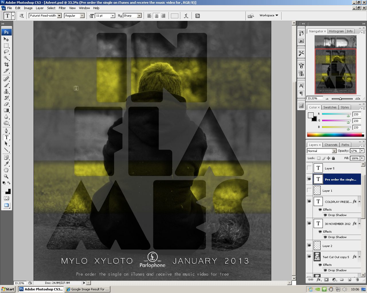
10) The text needed to be slightly altered by changing the spacing and alignment of the logo. I matched up the bottom line of the text 'parlophone' with the mylo xyloto text and the spacing of the promotional text.

FINAL ADVERTISEMENT:

No comments:
Post a Comment