Friday, 14 December 2012

HCT: Question 1

You can use Andrew Goodwin’s (dancing in the distraction factory, 1992) critical framework to analyse our new music video for ‘Up in Flames’ – Coldplay (Mylo Xyloto). From viewing our video you can see that it conforms to the typical conventions of a modern music video in that there is a clear relationship between the music and visuals as well as an increasingly popular convention of visuals before the music begins.

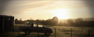

The music video conforms to conventions of this genre of alternative pop, for example we shot at 720p at 50 frames per second allowing us to slow the footage 50%, giving the video a dull emotional feel. We further reinforced this through emotional colouration and de-saturating our image around 40%-this gave a cold, seriousness to the video. Also the iconography in the video, specifically costumes the character wear are modern and commonly associated with the ‘pop’ scene.

The performance in the video is conventional in some respects however in others it could be seen as quite an artistic, conceptual approach. For example the protagonist is lip syncing to the lyrics although this action is very normal he seems to be in an unconventional location of a rural area, which challenged stock locations. Therefore some shots of flames and the teddy burning are very unconventional of this style as the performance shots seem incongruous and disjunctive.


 The post production is somewhat conventional in that the typeface is related to the traditionally used ‘Every true type is a waterfall’ font in the Mylo Xyloto album. They are used for the main titles in the video whilst the record label logo is also shown to be conventional.  A slightly transparent effect by changing the opacity of the title is shown which creates a unique style. Using these fonts also increases the bands meta-narrative and image as they are used with the Mylo Xyloto album. This construction is also reflective of the genre.


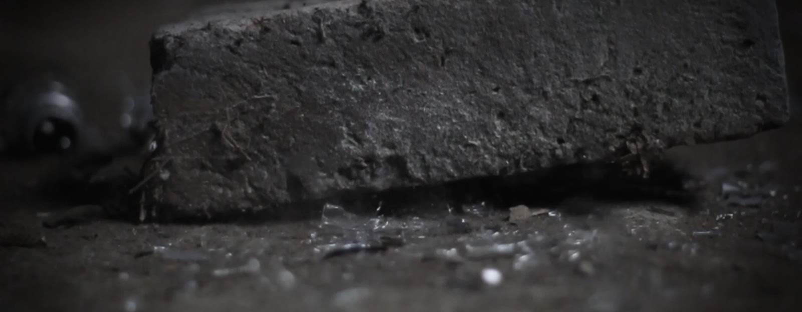
                The video employs an artistic/creative approach to conventions in that there are many shots throughout the video that seem irrelevant to any kind of narrative such as the flames and light bulbs. They may also seem unconventional in that much like the child lip syncing; the bulbs and brick seem unorthodox in relation to the music creating it as a pastiche and reworking of a deeper meaning or signifier. Although these shots seem disjunctive they are a part of a narrative, this creates repeatability and an intriguing style.


                Goodwin discussed the relationship between lyrics and visuals to be an important convention. In relation to the whole video, it is clear that the main singer is lip-syncing in time as well as moving to the beat expressively. This reinforces the words and themes trying to be portrayed. However in the chorus sequence it is more performance-based and lip-syncing is shown more loosely as visuals are primarily based upon ‘flames’ and destruction. This is because the image of the real flames is a much more powerful image that the shot of purely one singer as it is more illustrative, especially for the chorus where the song is more upbeat creating an amplified message. This is important on a song of slower pace.

                 He also considered the relationship between music and visuals to be important conventions. In certain shots we can see evidence of some kind of link between the music and narrative trying to be portrayed. There is a hard narrative to understand and could also be seen as a pastiche of certain elements such as a child’s life or a situation is metaphorically going ‘up in flames’. In some negotiated readings we are unsure on the particular meaning of this narrative and therefore quite a lot of enigma surrounds the narrative.


                  The narrative also draws upon binary oppositions through the juxtaposition of the solitary child and happy children in the background. This is done through their raw emotions as the protagonist is seen to be dull and emotionless whilst the children are laughing and enjoying themselves. Also through iconography and mise én scene the dull and dark costume of the protagonist contrasts against the children’s warm, bright, colourful clothing. The bands meta narrative is addressed through the symbols on the protagonists cheek. These relate to the album and Coldplay overall image.


                He made reference to the notion of looking. The particular effect represented in this music video is how the boy is and the only character in the video breaking the fourth wall and looking directly into the camera, reaching out to the viewing and allowing us to see into their emotions through an extra diegetic gaze.
       

Tuesday, 11 December 2012

HCT: Advertisement Construction

I used Adobe Photoshop CS3 to construct my advertisement for or song of choice - 'Up In Flames'. I decided to use print screens to keep track of my progression so that I can place them onto the blog here and explain the process.

1) Firstly I created a blank A4 document as this is the size we would be printing onto. Through 'File' 'New' and selecting the international paper size of 'A4'


2) Next I used the 'Place' tool to put the photograph of the boy in. We took this photo on the second shoot day. I used the 'Black and White' tool in the image adjustment menu after 'resterising the image' in order to customise the black and white effect. I also used other adjustments such as 'Shaddow and Highlights' and the 'curves' tool to change the white highlights and darker tones to create a more contrasted image.


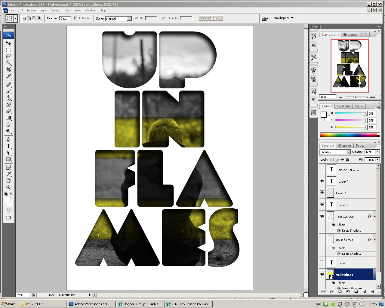
3) After creating the black and white base image I created a text layer and typed 'Up In Flames' in the conventional coldplay font which i found on dafont.com as 'every truetype is a wisefont'. I then used the 'magic wond tool' to select hte text, selecting inverse and deleting to create an effect that made the text subract itself. Then the selection allowed me to fill the outer area around the text with white so the text was visable.


4) After I used the 'Magic Wond' tool to select the text, right clicked and selected 'feather'. I changed the feather property to 6px. This was to get rid of angle sharp edges that didnt look natural, the result is shown below.


5) Then I used the 'Rectangle Marquee Tool' to draw two rectangular boxes and painted them yellow. This looked great although it masked the original image and was quite dazzling. So I changed the 'opacity' to 63% which gived a great look.


6) After I thought that the Coldplay font  needed a shaddow, so I applied a 'drop shaddow' effect by double clicking on the layer and changed the angle to 56%, the distance to 9px, spread to 9% and the size to 5px.


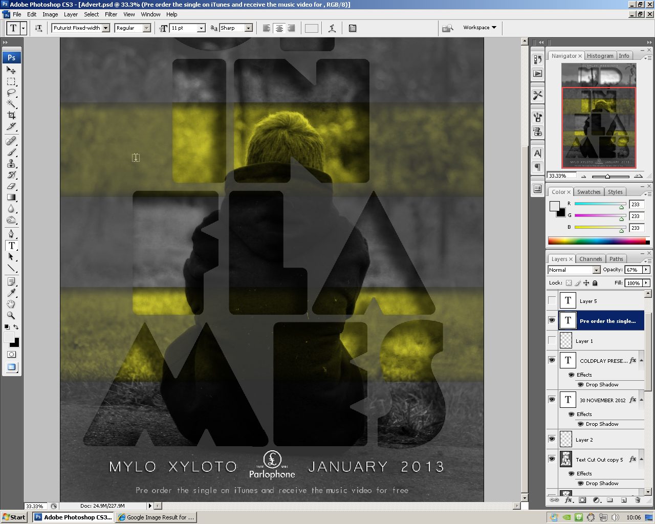
7) After this I thought the the orginal image was still very masked by the white background and that there was quite a lot of negative space in the advertisment. I changed the opacity of the white to 53%. This allowed the original image to seep through and just about ilimate any negative areas. I also added some titles to the areas above and below to make our advert more convention. These included 'Coldplay Presents' at the top and 'Mylo Xyloto - January 2013' at the bottom. I did this by using the text tool. I also applied the same drop shaddow effect as before to this text.


8) Then i decided that the white was quite contrasting to the main image underneath. I selected that layer and used the paintbursh tool to paint on a darker grey colour.whilst keeping the same opacity. The overall effect looked very good and was a good representation of the dull feel we were portraying.


9) After this I thought that there could be some kind of promotion at the bottom, similar to the one I analysed as part of my research to make it more conventional. I also 'placed' the parlophone logo and made the white transparent by using the magic wond tool and deleting the selection. I thought that a promotional text line would be appropriate to advertise the music video. I came up with, 'Pre-order the single on iTunes and recieve the music video for free.'


10) The text needed to be slightly altered by changing the spacing and alignment of the logo. I matched up the bottom line of the text 'parlophone' with the mylo xyloto text and the spacing of the promotional text.


FINAL ADVERTISEMENT:


Monday, 3 December 2012

Friday, 30 November 2012

JP: Editing Updates

Below are several printscreens illustrating how we have progressed during post-production.

This screenshot shows how I used the motion tool on Adobe Premiere Elements 9 to align our clip and size it correctly in order for there to be a seemless change for our ending.


I cut the same clip up into 3 sections and used the time stretch tool to speed all 3 up at varying speeds and overlayed them on top of each other using different tracks and altering the opacity tool. I then used the fast blur tool to slighly blur the clips to give the effect that the boy was posessed or devil-like.


Below is a screenshot showing our timeline so far and how we have begun to overlay clips using fading transitions and altering the opacity.


I used the motion tool on this clip to stabilise it and frame it better and track the boy skipping.


I have began to use the RGB colour correction and the HLS tool to desaturate the clip to make it more cinematic.


Simliarly I used the HLS tool on the footage of the flames to slightly desaturate them again giving a more cinematic, professional feel and tone.


Wednesday, 28 November 2012

HCT: Spare Clips

We have a number of clips that are unorganised, sitting to the right of our timeline. We need to organise these clips as it is clogging up the process and is confusing when trying to find clips and sorting the usefull from the useless. This print screen shows these spare clips, as you can see it is hard to see what each clip is when un-rendered and when they are this small.

HCT: Editing Update

Today this is what our timeline is looking like. I have ordered our clips into a more systematic arrangement so that we have a rough cut to go by. The result means we have found areas that need to be improved and others that are ok. There is still a lot that needs to be done before completion although we are getting there.
The following things I have seen that need to be altered:
  • Good relationship between the last two shots and matching.
  • Colour grade the entire video.
  • Patch up some of the areas where lip syncing is not good.
  • Reduce the amount of shots of just fire.
  • Double check cutting rate and timing of cuts throughout.
  • Show rough cut to the class to get feedback on the whole video.
  • Apply vignette where needed.


Monday, 26 November 2012

JP: Editing Update

During the last few lessons and today's lesson I have imported various steadicam shots of the children playing to the timeline and shots of the flames to intercut the main meat shot.

One thing I have particularly done is overlayed footage using the opacity tool which is shown in the screenshot below. This looks more cinematic and professional.